Pocket Science
logo
typography
Copy/body text: Open Sans
Alternative body text: Klavika
Headings: Bebas Neue
destination
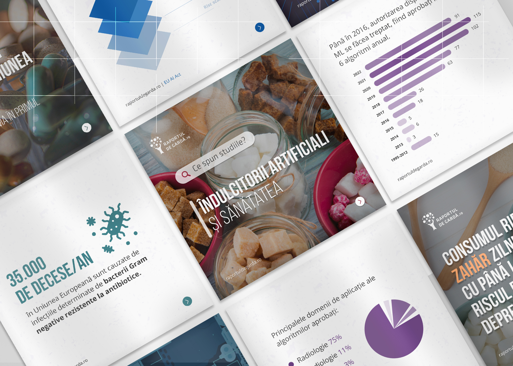
Graphic design and illustration for digital purposes – Social Media Carousel (Instagram).
brief
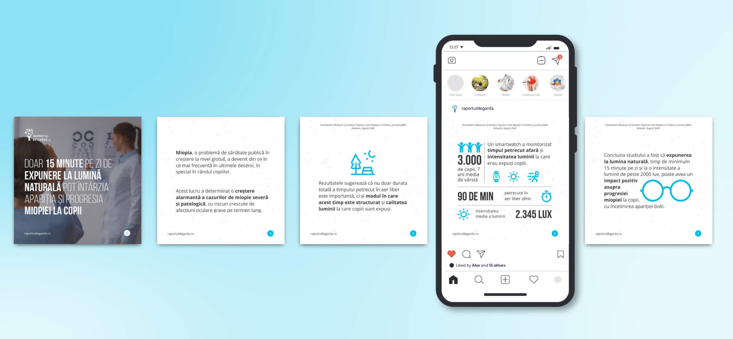
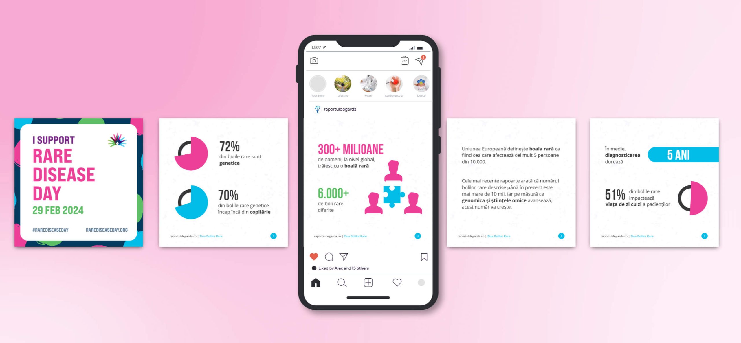
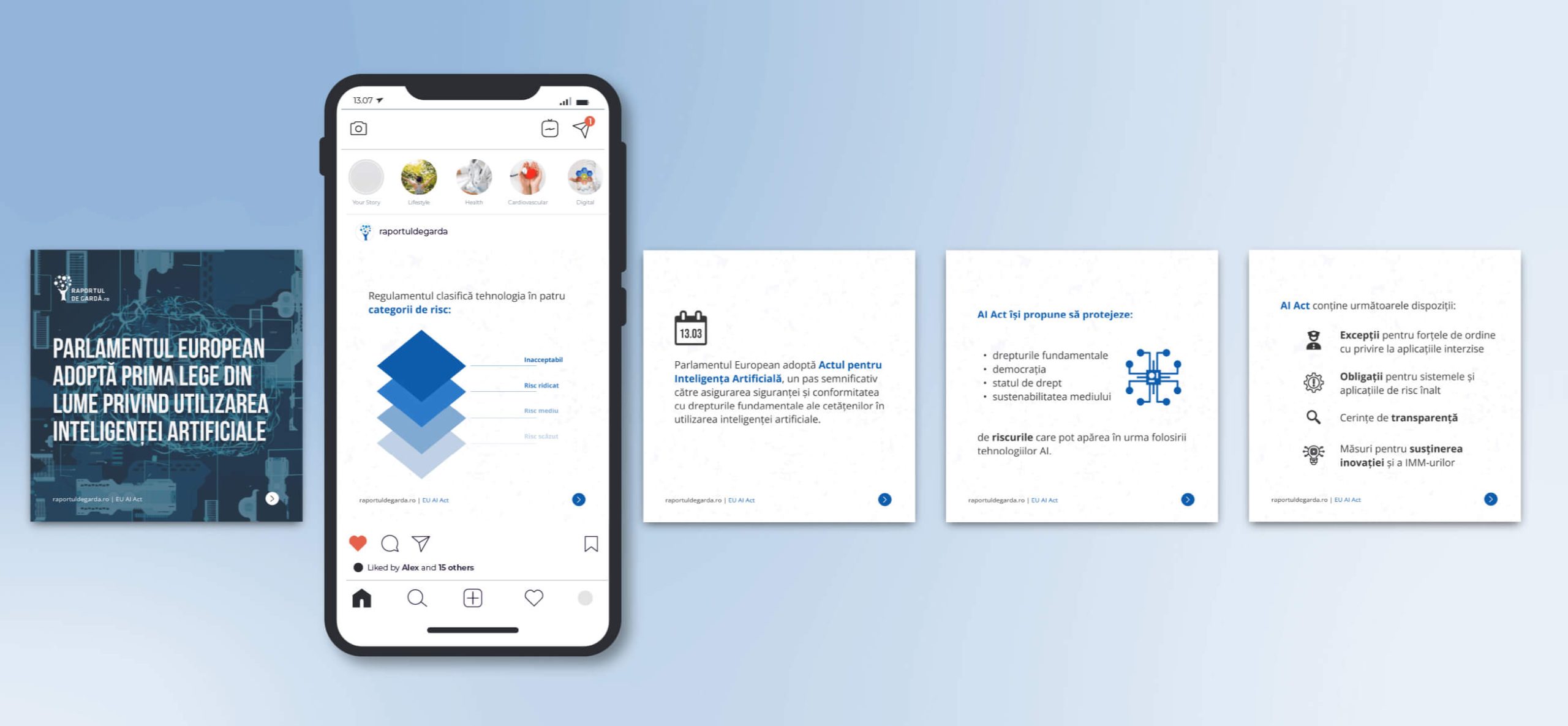
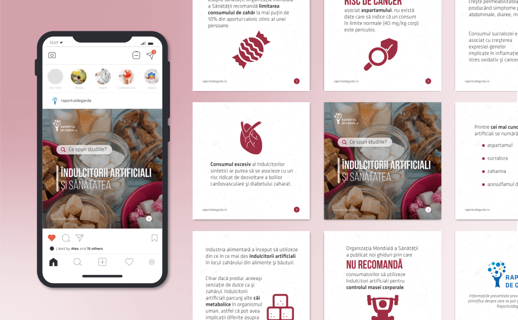
The appeal of this project for us was in trying to summarize academic and scientific resources in a way that would fit 30 different medical topics in a series of carousels for social media. Our goal was to properly represent the information in an engaging way, and keep the nuance of it as much as possible.
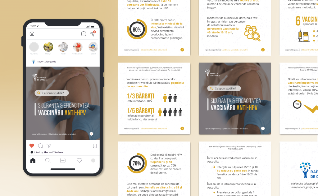
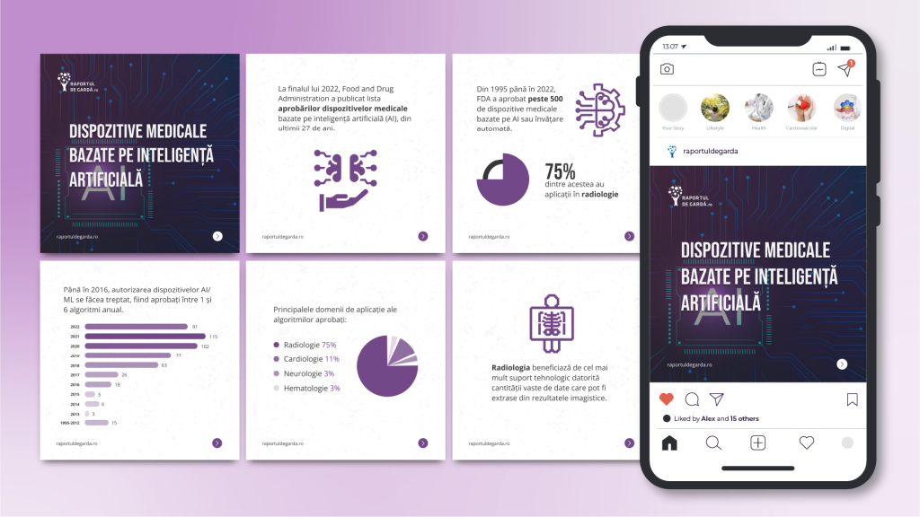
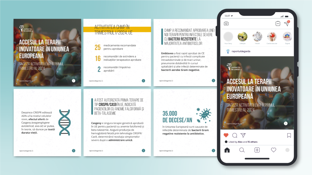
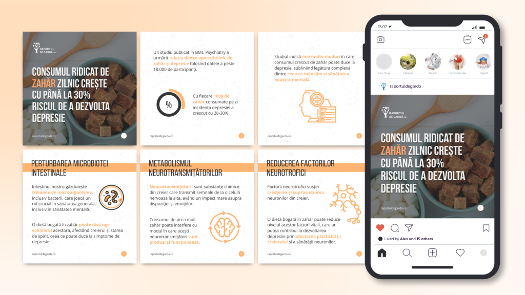
As mentioned, we had at our disposal a series of 30 different medical topics, and each carousel had to have at least 5 cards or slides, meant to be posted on Instagram. For each of them simple but compelling visuals had to be created that would enhance the written information. Information which would need to be gathered by researching statistics, scientific articles, and other academia resources. These aforementioned visuals had to contain brief infographics, charts, pies, and other graphs that would highlight key data and support the reader in digesting the information. We also had to take into account when designing the cards that they are not supposed to follow branding guidelines regarding the color palette, but they had to keep the brand’s typography choices and logo. Preferably, the colors should enhance the viewing experience and draw attention to the information within.
By taking into account that the carousels were meant to present current trends, inform and educate the audience, we also had to tailor them for the chosen demographic: medical professionals, patients, and citizens interested in health news. The topics at hand included the importance of prevention in non-communicable diseases such as cancer and cardiovascular diseases, the impact of machine learning and technologies in healthcare, how lifestyle factors intertwine with genetic factors in determining our health etc.
approach
Provided that the partner gave us full range of motion, meaning we had freedom to choose the topics, we also had to have a well established system on how we would do the research and how we would choose to present the information. As such we embarked on the research journey keeping a few key aspects in mind like data accuracy, readability, and clearness, because of their importance when it comes to translating medical information to make it more approachable.
Next we designed a general template that was used for all the carousels. The first slide portrayed a vibrant and appealing featured image, overlaid by the carousel’s title and the partner’s logo. Being the first image the viewer sees, our goal was for it to be creative, impactful and energizing. The following slides had to contain the information for each topic, so we decided to keep a white background with a randomly dotted pattern so that it would keep the design cohesive, but it wouldn’t take away from the information presented and other graphic elements we would include. As for the bottom half of these slides, they would contain an arrow to show there was more continuous content and encourage the viewer to swipe and the partner’s name. The last slide had the same design choice as the contents, displaying the partner’s logo and a portion containing information about the sources used.
The design was thought in this manner so it would encourage the viewer to seek more information on certain topics, to be more curious about the latest developments, innovations and news regarding the healthcare domain.