Creator’s Performance
logo
typography
Copy/body text: Open Sans
Alternative body text: Klavika
Headings: Bebas Neue
colors

destination
Data analysis & graphic design for both print and online purposes.
Report data has been changed for confidentiality reasons.
brief
The client wanted a better way to understand the impact and performance of their communication campaigns and content over the span of three months. The issue was the bulk of raw data available which meant for us to select data of interest, analyze performance parameters, and design a comprehensive report that would inform the managers about the current status and possible future improvements.
The goal is to have two report templates by the end: a social media performance report and a website performance report. The design should be clean, easy to follow, and highly informative, with visuals being more highlighted than the text. It had to follow and be aligned entirely with the company’s branding guidelines.
The data itself and information necessary is to be taken from Google Analytics, Google Search, Youtube, Spotify, and Meta Business Suite. It should be structured and analyzed such that the report presents key results and visual differences. The report would be used to help data analysts and campaign designers to be able to improve their strategy for future campaigns, and to better program their content for the desired reach.
approach
Having the necessary information at hand and in mind, we divided this project into two main components: data analysis, and graphic design. We began by defining, together with our partner, which of the most important aspects the report should be focused on. After clarifying the main topics and proceeding to filter data from the provided data sources, we created the initial reports. They were text-only, having extracted key performance indicators and identified several directions for improvement accordingly.
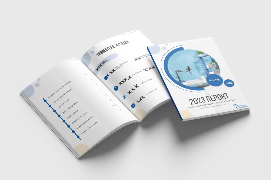
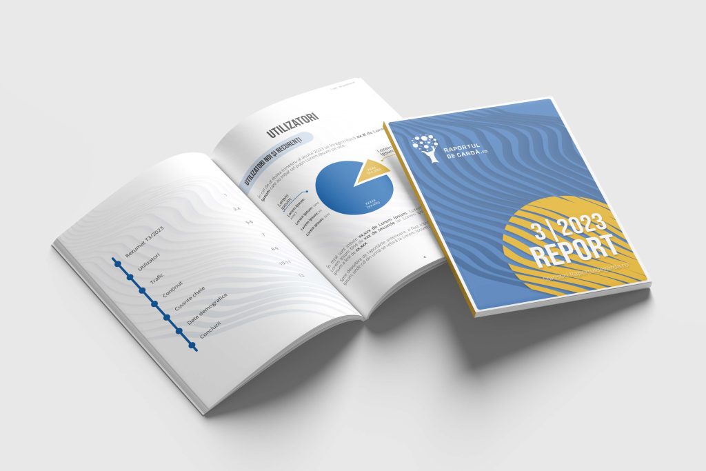
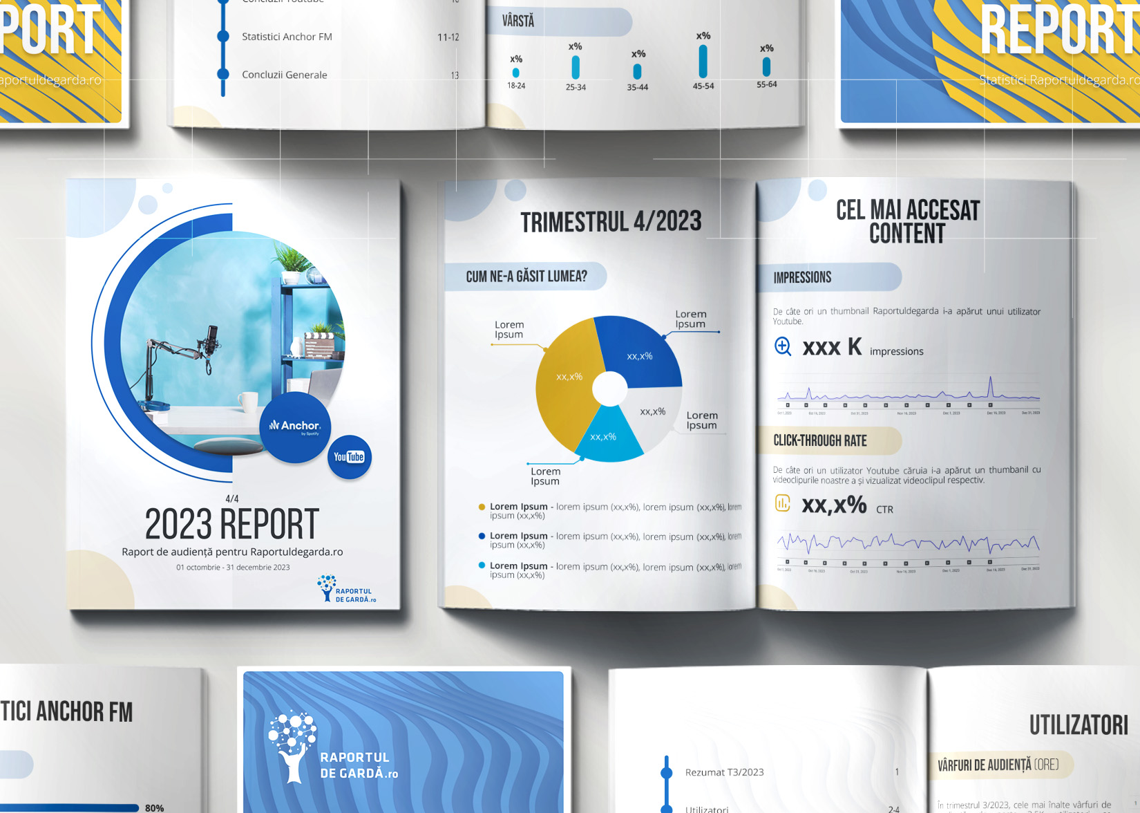
That freed us up to start the design process. Two different key visuals were created for the cover pages, both of them designed using suggestive visuals, and contained information about the report’s title, number, and time frame in which we analyzed the data. The first report addressed the performance of the audio and video content, hence we went for a more youthful and informal approach when choosing the design for it. The second report addressed the website’s content and campaigns performance, which meant for us a more business-like and methodical approach.
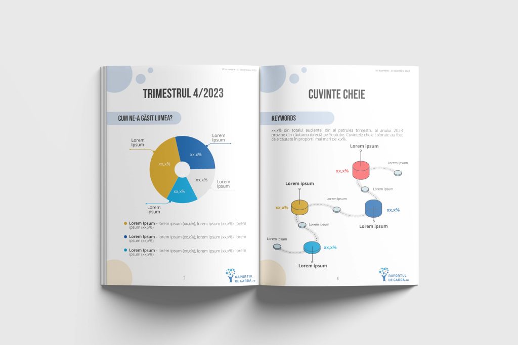
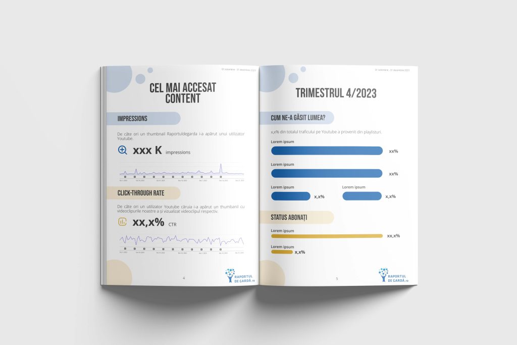
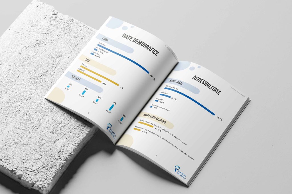
When it came to the reports’ contents, we went for a simple approach in both cases, so that the information would be highlighted, rather than the design distracting from it. We used suggestive icons, charts, and pies to present data in a visually appealing and comprehensive way. We kept a balanced and uniform approach throughout the reports, in order for the reader’s attention to be on what matters for the company.