Trainer’s Toolkit
logo
typography
Headings – Oswald
Copy/body text – Roboto
colors

destination
Graphic design and illustration for printing purposes.
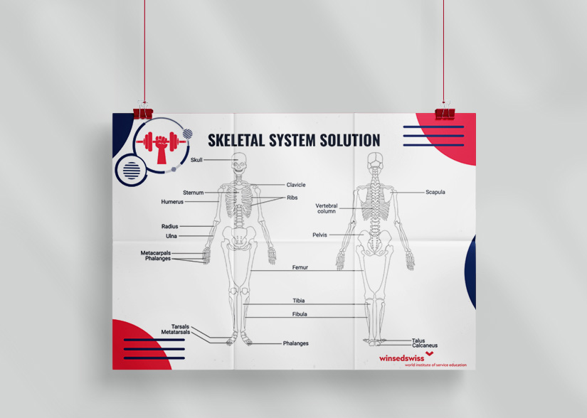
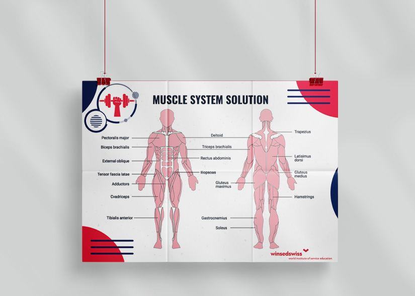
Number of deliverables: 74 printed documents; 109 (illustrations, icons, badges, figures, schemes); 18 tables; 2 anatomical posters (90×200 cm).
brief
When we were first approached with this project we were both excited and eager for the challenge ahead. Not only for the contents of the project being a personal trainer offline course, but to see where we could take the vision.
We were told that the project would consist of educational materials structured in 3 courses, destined for students who are preparing to become personal trainers. The curriculum contained inside the project would take them from basic fitness concepts to establish a foundation, to complex anatomical structures and functions so they could further hone their craft. The materials for the course would be printed and handed to them and they’d either be for theory or practice, with an A4 and A5 paper format. Posters would also need to be hung on the class’ walls, for further visual support. There would also be a need for cards in an A6 paper format that would be used in role-playing exercises, their purpose being of a more practical approach to the materials in the project.
Having a pre-established curriculum (text-only) to include, we would need to make a series of icons, badges, graphs, tables and illustrations to accommodate the written information. The 3 courses mentioned would be focused on different subjects, so there was a need for immediate visual differentiation between the materials. Each course would have different deliverable needs, ranging from A4 & A5 files, to life-size anatomical posters; some would be text-oriented, others illustration-oriented. Visuals would need to align with the partner’s brand identity.
approach
After the initial discussion with our new partners, where the scope of the project was established and the materials needed were provided, we started on our work. We began by researching standards and best practices when it comes to visual communication for educational materials. We then prepared two moodboards which helped both us and our partners have a clearer vision of the direction in which we wanted to go. After which we prepared three variations of the main template such that our partners could choose which one they deemed more fitting.
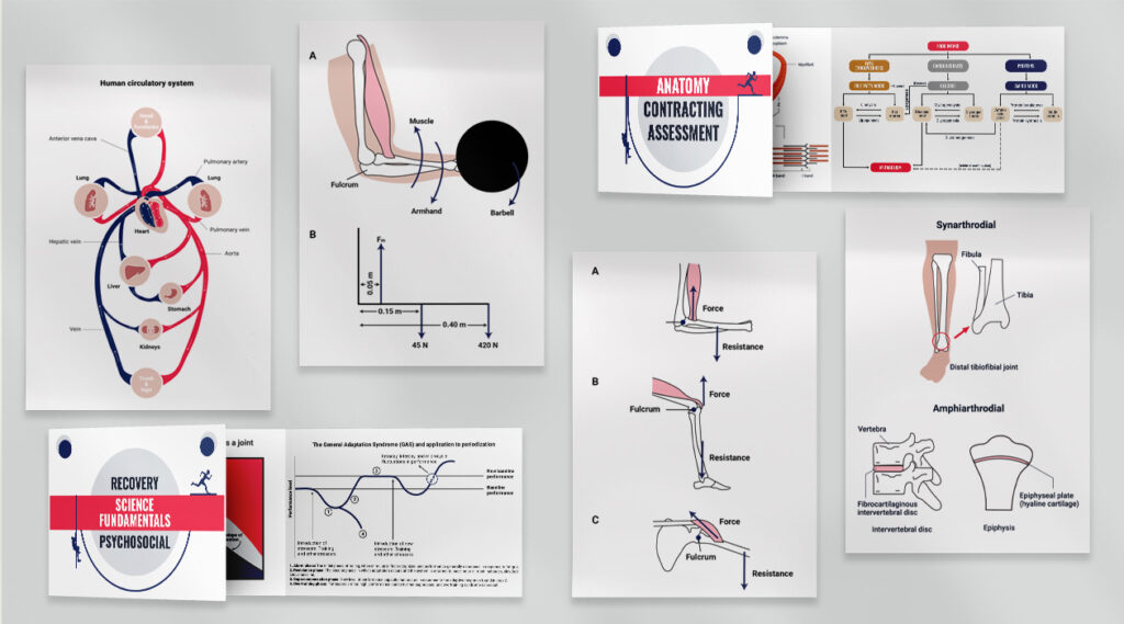
The next step was to design a general template for each of the three courses by following the instructions in the brief: clear, minimalist, appealing and motivating. One of the symbols we have chosen as an important element in the design was the circle: it represents the central and repetitive motif of our overall theme, it suggests continuity and movement much like the learning process itself – a neverending cycle. At the same time, the rounded approach can inspire a youthful and dynamic environment, encouraging brainstorming and taking action. The background is dimly texturized, enough so it adds depth to the composition, but not too much so it won’t distract from the importance of the text.
In order to be able to differentiate between the three courses we also designed three separate badges that were added in the upper left corner of our template, in such a way that it was cohesive to the theme at hand, and also for each of them to be representative of their corresponding course.
cards, figures & posters
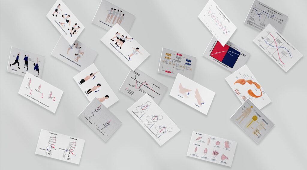
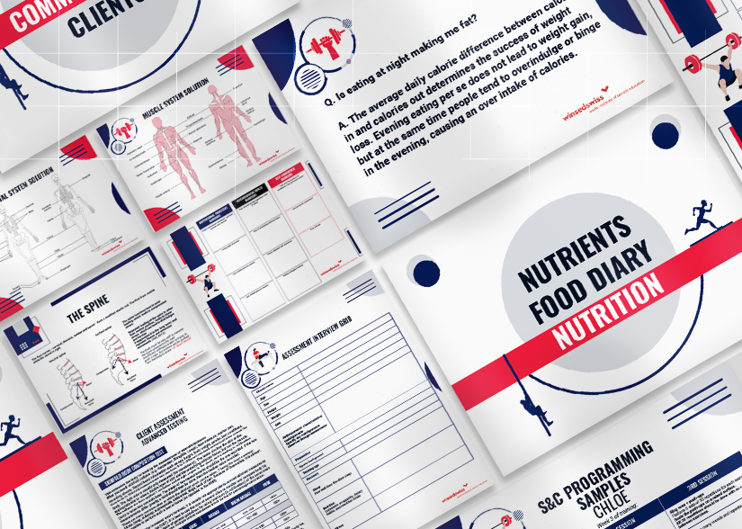
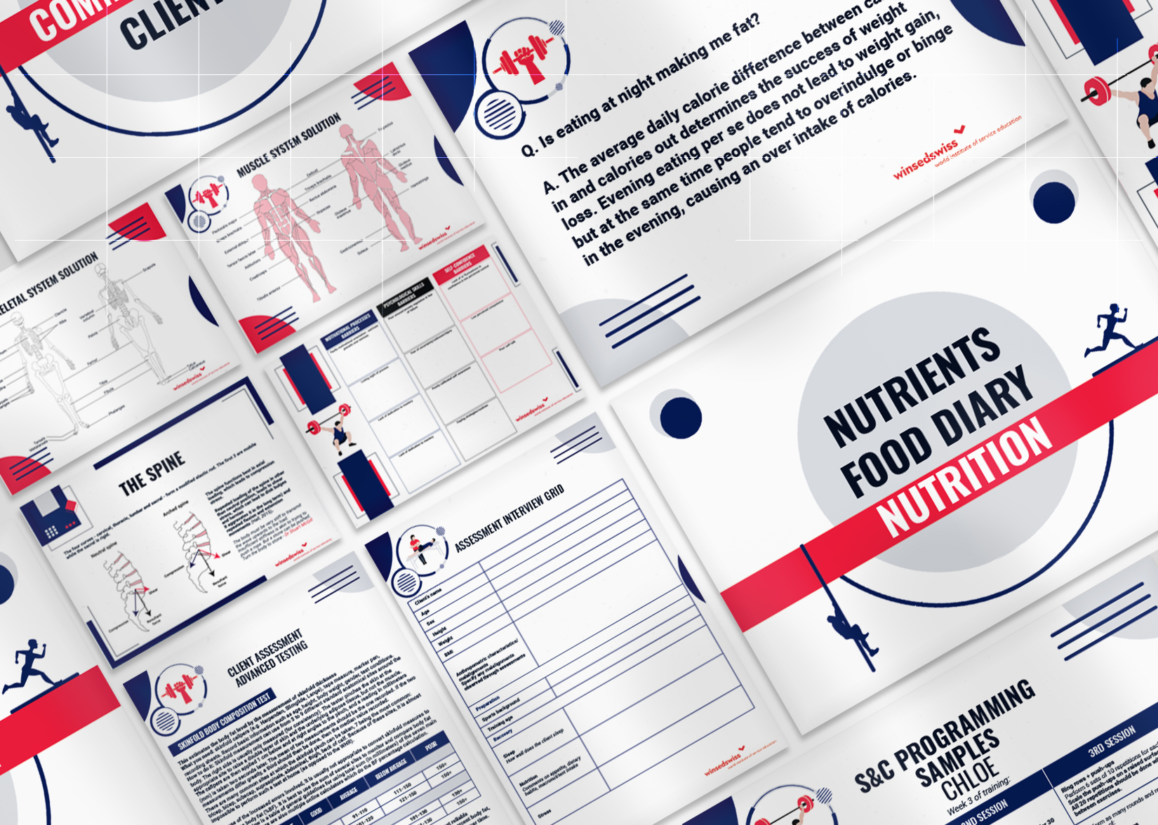
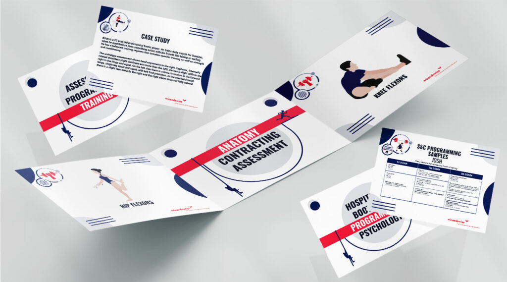
For the A6 cards, we also designed a background for the back of the paper, following the same principles of dynamism, movement and physical activity. Each backpiece highlights the topic addressed by the cards.
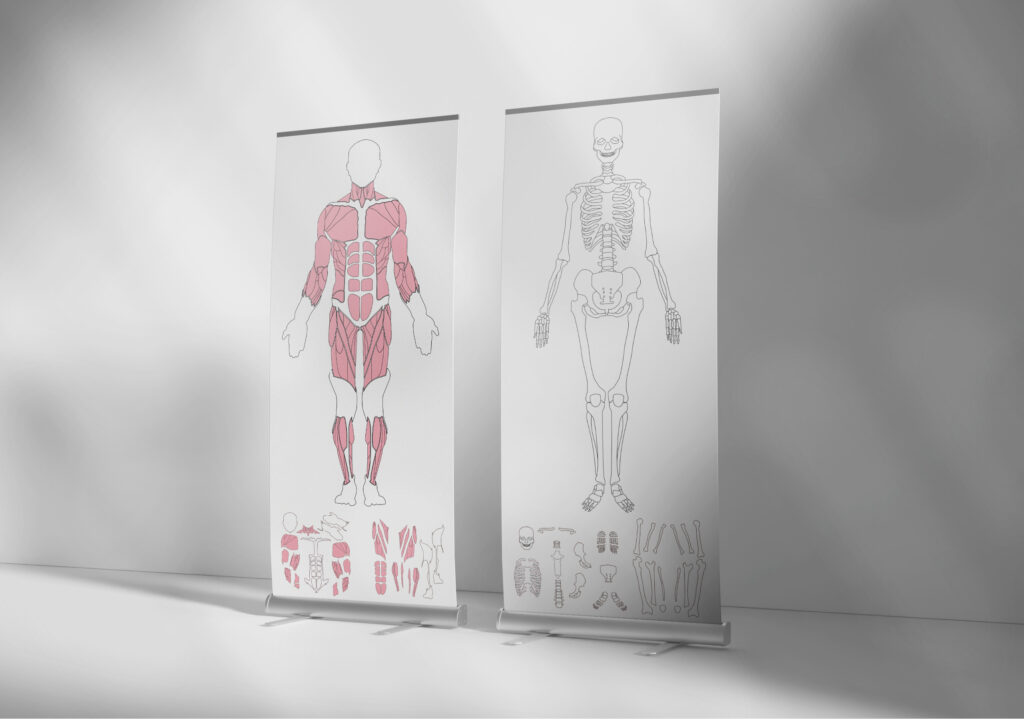
Anatomical life-size layouts portraying the human muscular and skeletal systems were conceptualized and designed as a puzzle. Each of the pieces were designed and placed apart in the project deliverable, such that they can be cut out, tagged with their corresponding name and much like a jigsaw, arranged in their correct order.
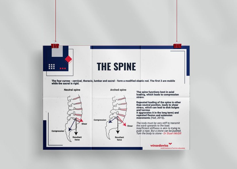
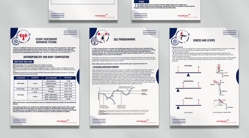
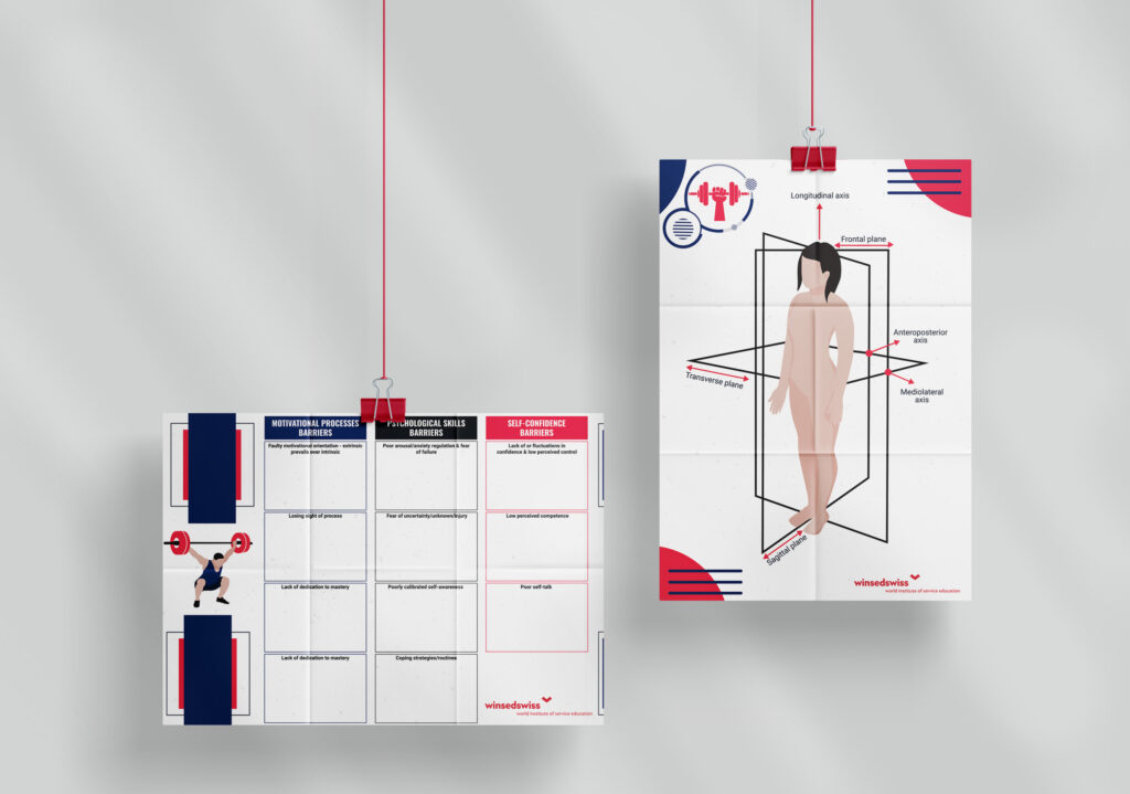
Personalized figures were created to accompany the written material of the project. They were made with needs of the project in mind, meaning anatomical, bio-mechanical and fitness concepts. They were created individually, inspired by postures, figures and drawings from specialized materials. Their role was to be used as a visual support and to enhance the students’ understanding of the information, as well as to help them better visualize different movements and body parts presented in the courses.
The posters were designed with both a theoretical and practical approach in mind. The former’s characteristics are that they highlight fitness 101 concepts and portray anatomical figures (human muscular and skeletal structure, the spine, tissue loadings). Meanwhile the latter’s characteristics are that they are meant to act as a physical support and be interactive and guide the students through their activities which can also require them to complete blank spaces or attach sticky notes directly on the posters.